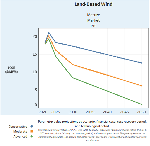
LCOE of Land-Based Wind
Here is the original chart I attempted to recreate

LCOE of Land-Based Wind Recreation
Here is my attempted recreation of the above chart
We've organised the page into sections, with each section containing a chart, title and a description. Here, we can describe the chart and give some context. As a first example, we're using a basic chart from our repo.
White founts falling in the courts of the sun, And the Soldan of Byzantium is smiling as they run; There is laughter like the fountains in that face of all men feared, It stirs the forest darkness, the darkness of his beard, It curls the blood-red crescent, the crescent of his lips, For the inmost sea of all the earth is shaken with his ships.
They have dared the white republics up the capes of Italy, They have dashed the Adriatic round the Lion of the Sea, And the Pope has cast his arms abroad for agony and loss, And called the kings of Christendom for swords about the Cross, The cold queen of England is looking in the glass; The shadow of the Valois is yawning at the Mass; From evening isles fantastical rings faint the Spanish gun, And the Lord upon the Golden Horn is laughing in the sun.
Dim drums throbbing, in the hills half heard, Where only on a nameless throne a crownless prince has stirred, Where, risen from a doubtful seat and half attainted stall, The last knight of Europe takes weapons from the wall, The last and lingering troubadour to whom the bird has sung, That once went singing southward when all the world was young, In that enormous silence, tiny and unafraid, Comes up along a winding road the noise of the Crusade.
Strong gongs groaning as the guns boom far, Don John of Austria is going to the war, Stiff flags straining in the night-blasts cold In the gloom black-purple, in the glint old-gold, Torchlight crimson on the copper kettle-drums, Then the tuckets, then the trumpets, then the cannon, and he comes. Don John laughing in the brave beard curled, Spurning of his stirrups like the thrones of all the world, Holding his head up for a flag of all the free. Love-light of Spain—hurrah! Death-light of Africa! Don John of Austria Is riding to the sea.
I went to the Legacies of Empire talk, and frankly it didn't discuss much economics. I've done my best to create charts on inequality and productivity.
This demonstrates some of the systemic inequalities Britons face despite the ever increasing productivity.
Here is the original chart I attempted to recreate

Here is my attempted recreation of the above chart
I have changed the backgrounds and colors to create a more unified color scheme, and edited the titles and labels for clarity.
I chose this site because I like sports stats, plain and simple.
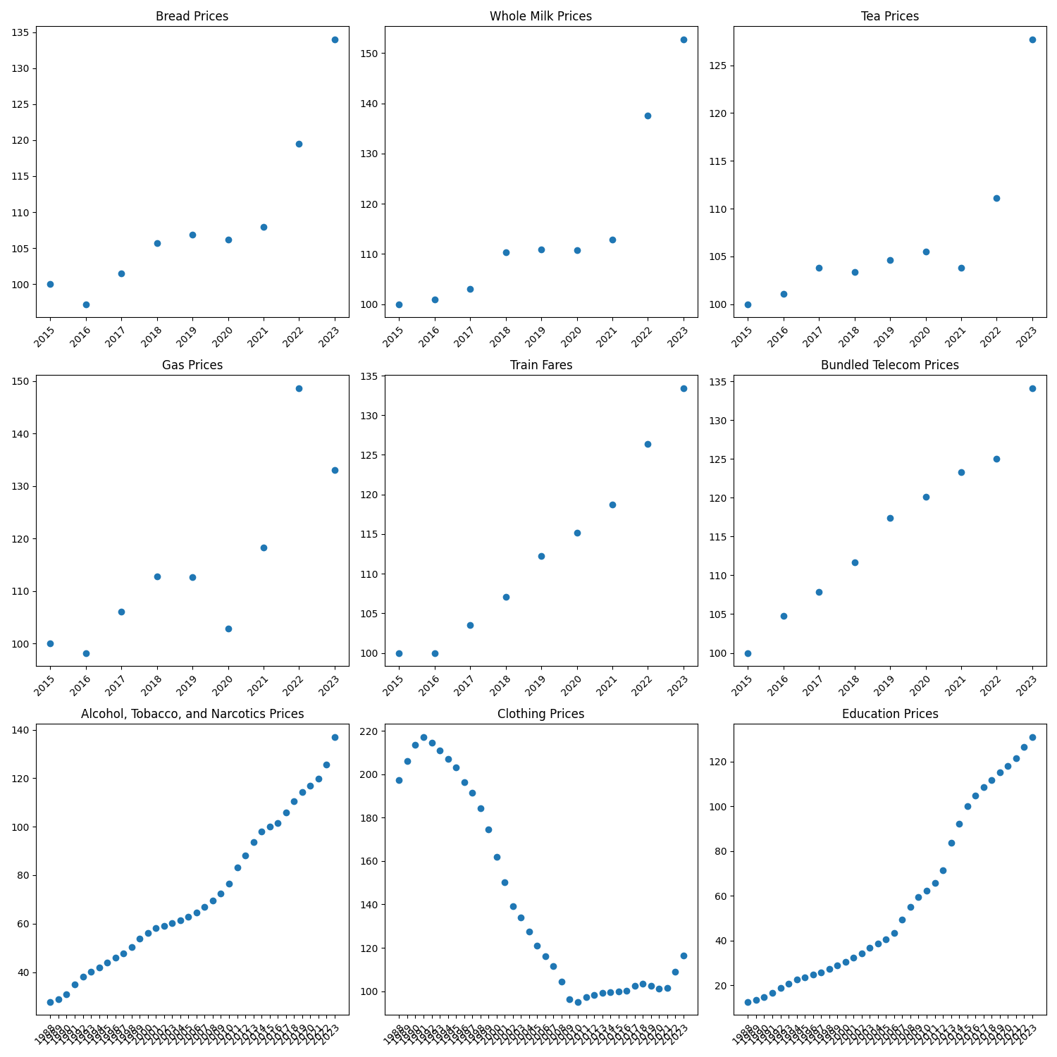
Here are 9 charts representing various CPI indices and good bundles

This is simply a base map of every county in the US
Utilizing the base map from above, this is a choropleth map showing the population of every county in the US.
This is a scatterplot and regression line that demonstrate the high correlation between higher temperature and an increased amount of shark attacks.
This is a histogram showing the distribution of mothers' heights in US territories. I chose this dataset because it is relatively close to a normal distribution, which I find interesting.
These two charts both show the median price of an 800g loaf of white bread in the UK. The first shows a snapshot of a given year across the whole nation. The second shows a snapshot of a given region across the whole time period.
This is one interactive element I'm experimenting with for my final project; using a date selector to narrow or widen the field of investigation.